Distribution Plot
The distribution tab of graphics menu contains 4 options of data visualization i.e., Density, Histogram, P-P plot, Q-Q plot.
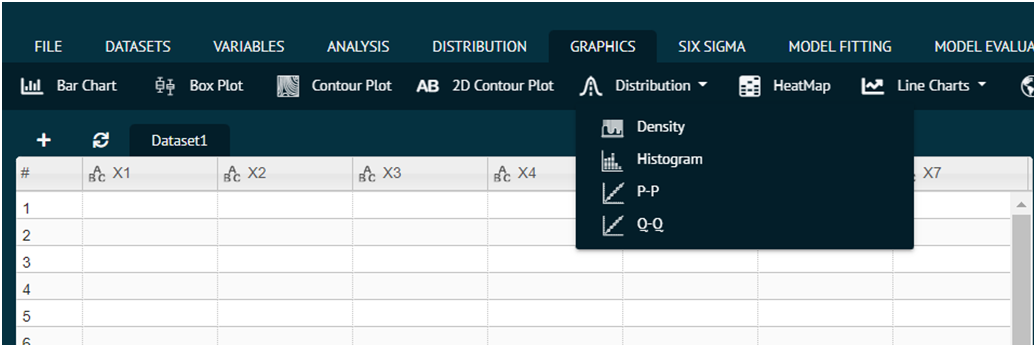
The function of each option is discussed below.
Density
For representing any dataset in terms of Density plot.
- Steps
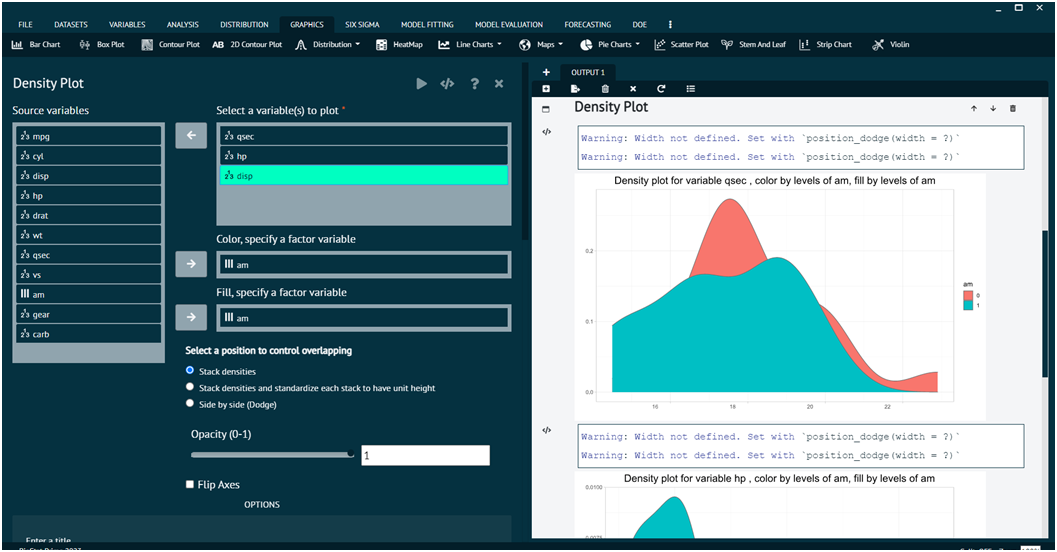
Load the dataset that needs to be visualized -> Go to Graphics -> Distribution -> Density -> Put in the values for variables -> Execute the dialog.
The output of the Density Plot of a sample dataset can be seen in the picture below.
Histogram
For representing any dataset in terms of Histogram.
- Steps
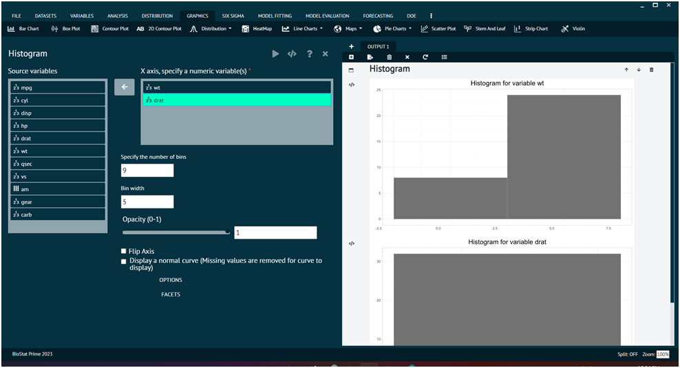
Load the dataset that needs to be visualized -> Go to Graphics -> Distribution -> Histogram -> Put in the values for variables -> Execute the dialog.
The output of the Histogram of a sample dataset can be seen in the picture below.
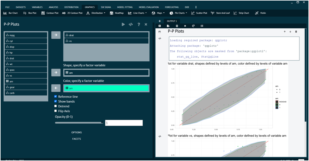
PP Plot
For representing any dataset in terms of PP Plot.
- Steps
Load the dataset that needs to be visualized -> Go to Graphics -> Distribution -> PP -> Put in the values for variables -> Execute the dialog.
The output of the PP Plots of a sample dataset can be seen in the picture below.
QQ Plot
For representing any dataset in terms of QQPlot.
- Steps
Load the dataset that needs to be visualized -> Go to Graphics -> Distribution -> PP -> Put in the values for variables -> Execute the dialog.
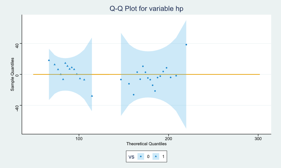
The output of the QQ Plots of a sample dataset can be seen in the picture below.
