Line Charts
The Line Charts tab of graphics menu contains 4 options of data visualization i.e., Frequency Chart, Line Chart, Plot of Means, Two Y Axis.
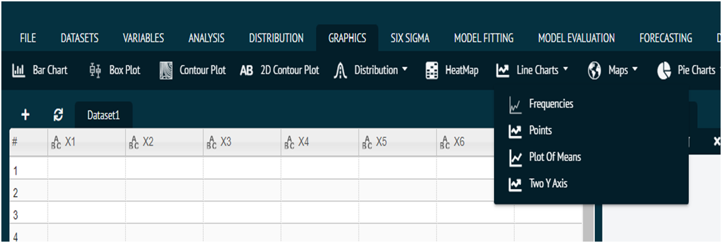
Frequency Chart
For representing any dataset in terms of Frequency Chart.
- Steps
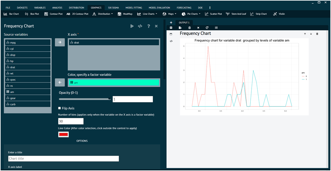
Load the dataset that needs to be visualized -> Go to Graphics -> Line Chart Frequencies -> Put in the values for variables -> Execute the dialog.
The output of the Frequency Chart of a sample dataset can be seen in the picture below.
Line Chart
For representing any dataset in terms of Line Chart.
- Steps
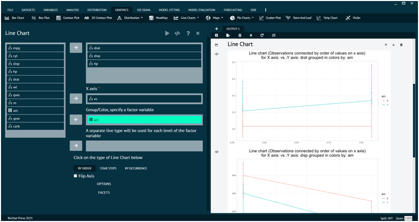
Load the dataset that needs to be visualized -> Go to Graphics -> Line Charts Line Chart -> Put in the values for variables -> Execute the dialog.
The output of the Line Chart of a sample dataset can be seen in the picture below.
Plot of Means
For representing any dataset in terms of Plot of Means.
- Steps
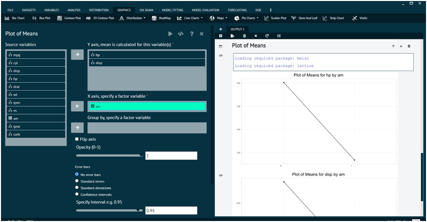
Load the dataset that needs to be visualized -> Go to Graphics -> Line Chart -> Plot ofMeans -> Put in the values for variables -> Execute the dialog.
The output of the Plot of Means a sample dataset can be seen in the picture below.
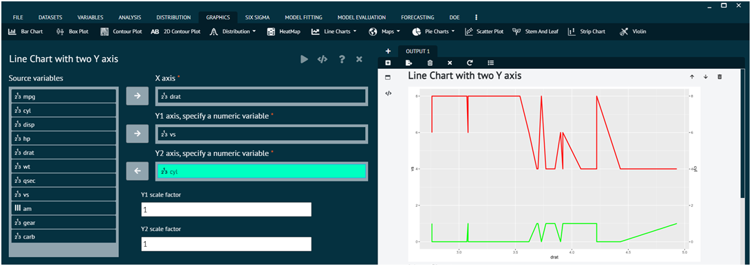
Two Y axis
For representing any dataset in terms of Line Chart with two Y axis.
- Steps
Load the dataset that needs to be visualized -> Go to Graphics -> Line Chart -> Two Y Axis -> Put in the values for variables -> Execute the dialog.
