Pie Charts
The Pie Charts tab of graphics menu contains 2 options of data visualization i.e., Coxcomb plot, PIE Chart.
Coxcomb Plot
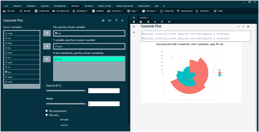
For representing any dataset in terms of Coxcomb Plot.
- Steps
Load the dataset that needs to be visualized -> Go to Graphics -> Pie Charts -> Coxcomb Plot -> Put in the values for variables -> Execute the dialog.
The output of the Coxcomb Plot of a sample dataset can be seen in the picture below.

Pie Chart
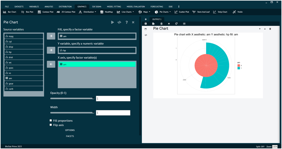
For representing any dataset in terms of Pie Chart.
- Steps
Load the dataset that needs to be visualized -> Go to Graphics -> Pie Charts -> Pie Chart -> Put in the values for variables -> Execute the dialog.
The output of the Pie Chart of a sample dataset can be seen in the picture below.

Last modified: 22 December 2025